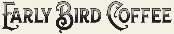
| Lettering between the late 1800's and early 1900's is often termed "vintage" and the two periods share many of the same attributes, with the majority of lettering in the late 1800's being recognizable as such by slightly thinner strokes and old west styling. The Art Nouveau influence was beginning to take hold, with fanciful flourishes and broader experimentation with letter forms. This is my favorite era for lettering and it, along with the Letterhead movement that exposed me to it, served as the inspiration to start Letterhead Fonts in 1999, which became the first foundry dedicated to this style. I later discovered several like-minded artists that also appreciate this era. Guys like Mark Searfoss have taken this lettering genre to heights that Atkinson, Henderson and Strong would no doubt be proud of. I'm afraid many inexperienced creators these days hide behind the "vintage" label, using it as an excuse to create poorly designed letters. A fundamental knowledge of lettering and the period is still required to create vintage-era fonts. |