

 |
ACCOUNT LOGIN |  |
YOUR CART |  |
|
Chrome Effects (continued) 6. Adding the top color Using the Rectangular Marquee Tool again, draw a box around the top portion of the letters starting at approximately the center of the letters where the gold color stops. Then go to Select | Feather and use 10 pixels. Go to Image | Adjust | Hue/Saturation. Check the Colorize box and use the following settings: Hue: 196, Saturation: 37, Lightness: +44. I then airbrushed certain portions of the T with white to soften the appearance a bit. Notice the blue area below the cross member has been lightened, as well as the ball at the beginning of the cross member at the far left. 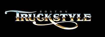
7. Creating the background The hard part is over-now for the fun stuff. Holding the Ctrl key down, select the layer you duplicated in step 1 containing the original white letters. This will create a mask around your letters. Go to Select | Modify | Expand and use 10 pixels. Using the eyedropper tool, select the brick red color from the Swatch palette. Go to Edit | Fill and choose Foreground Color. Deselect the mask by going to Select | Deselect and then position this red outline behind the chrome letters. Now duplicate this layer for later use. Blur the red outline layer by going to Filter | Blur | Gaussian Blur and using 36.0 pixels. 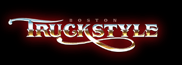
8. Creating the black outline
Select the red outline layer you duplicated in step 7. Change it to black by going to Image | Adjust | Brightness/Contrast and sliding both values to -100. Tip: You can also change the color of an object by going to Image | Adjust | Hue/Saturation and experimenting with the sliders until you see a color you like. This method is preferable to creating a mask and actually filling the object different colors, since doing so will result in noticeably jagged edges. 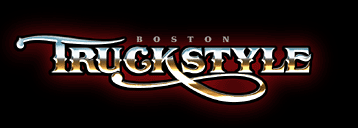
9. Creating the black dropshadow Duplicate the black outline you just created and position it to the right and down-behind the black outline and in front of the red background. 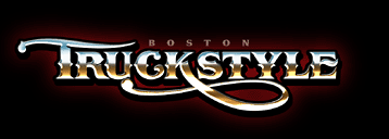
Finally, we add the sparkle of light at the lightest point on the lettering. Make a new layer. In your brushes palette, select the brush that looks like a four-pointed star. If you don't see it, you will have to load it. It's within the Assorted Brushes set, which is located in the Photoshop folder on your hard drive. Using the regular paintbrush at 100%, click near the place you would like to place it. Don't worry if it's not exact-we put it on it's own layer so that we can move it around later if necessary. You may have to click a few times in the same spot. Now enlarge that by going to Edit | Free Transform and holding shift while dragging one of the corners. Enlarging it will blur it, which is what we want. Rotate it if necessary so that you can see the other points. When you are satisfied, double-click in the center-or hit the Enter key if it's too small. Place these starbursts where the light would naturally hit the raised chrome letters. Our shadow is on the right so our hotspot is naturally on the left at the point where the light would be the brightest. Be careful about putting too many of these things all over-doing so can ruin the effect. Finally, save this file so you have a file with all these layers. Name it something like truckstyleLAYERS.psd. Flatten it, and then sharpen it by going to Filter | Sharpen | Unsharp Mask, using about 34%. Save it with a different name such as truckstyleFLAT.psd. 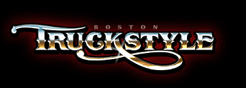
|
  |
||
 |
 |

|
CONTACT
|
|
|
|
|
|
|