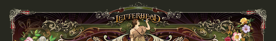


|
Packaging Design ProcessChuck Davis shows tips and tricks for this design in 5 easy steps. Learn how contrast, layout, and choosing the right fonts can help your product attract more attention. Step 1 The initial design uses LHF Hensler 2 Shadow along with LHF Classic Roman 2 on the banners and LHF Sofia Script. But something is definitely wrong. The spaces on either side of the word "Chocolates" is bad and this word competes with "Blue Mark" for attention. What do we want people to read first? What is number 1 here? What is number 2? The top portion of the background blue panel peeking up on either side of the top banner is distracting because it's such a small portion of color. It serves no purpose. If we were to keep this background panel, I would remove these top portions completely, but I have another idea... 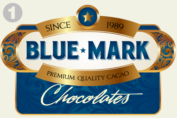 Step 2 The rectangular panel in the background was completely wrong. Rotating it makes it contrast better with the horizontal format of the panel in front. This also creates a smaller space for the word "Chocolates" so we can ensure that this remains secondary to "Blue Mark" and doesn't compete for attention. Darker blue for the rectangular panel also helps define the gold foil better, plus, it doesn't compete for attention. Since the gold foil is so bright and showy, a bright blue like we had is a mistake. We changed the font to LHF Ross Antique Roman from LHF Sofia Script to help remove the awkward confusing spaces created by using a script and to improve readability. The awkward gaps on the left and right underside of the bottom banner are dealt with by the subtle use of the larger "C" and "S", also adding an old fashioned feel because of the curls in the letters (and Studden's famous upside down "S"). We reduced the size of the "Blue Mark" letters to keep them in the center of the white panel and draw the eye in better. 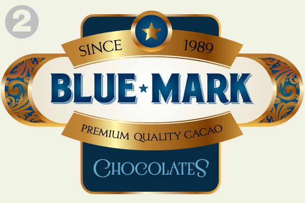 Step 3. Let's try a dark brown background instead to try to work in the "chocolate" motif. We've also brought back the scroll swirls that were present in the first design. Blue for the word "Chocolates" won't work on dark brown, so we changed that to the ivory/yellow color so we can read it. 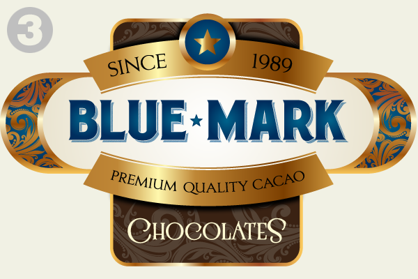 Brown was the wrong color for the background since it was so close to the gold color. Dark blue acts as a better frame and draws the eye into the white center. Some pinstripes on the dark blue background help break it up and draw the eye down through the design. A grey outside border helps tie it all together and defines the gold foil better. Darkened the blue inside the panel behind the scroll work to better define it. Added dark blue fade effect around outside of "Chocolate" to add depth and help define the letters. 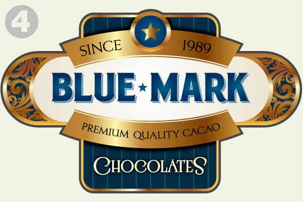 In an effort to equalize the width of "Since" and "1989", kerning was tightened on "Since, while "1989" was kerned looser and stretched slightly in width. All text on these banners was increased a bit to better fill the space. The gold foil highlight was moved to the center. Seems to make more sense, since everything about this design is symmetrical. The circle behind the star was changed to red for interest and the star lightened so you could see a little better. The grey outside border was changed to dark blue. Seems to hold it together better. The radial fade behind "Blue Mark" was darkened at the edges to increase contrast between the two colors and create a more dramatic glow in the center. The blue offset shadow on "Blue Mark" was changed to taupe to make for a more realistic effect against the new background color. This also helps separate it from the letters themselves to help readability a bit. Finally, "6 oz." was added at the bottom, a necessity, but also helps to balance the design. 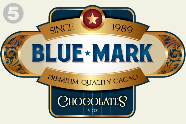
|
  |
|||
 |
|
||||
|
|||||
|
CONTACT
|
|
|
|
|
|
|