


|
Basic Layout PrinciplesWhat makes a good design? What makes people want to read your sign? Chuck Davis compares the good, the bad and the ugly. Thoughtful planning can mean the difference between a bad design and a successful one. Proper layout is a skill that can be learned. The eye and mind can be trained to create a 'logical layout". Here is an example of the importance of contrast and negative space. 1. The Ugly Lack of definite margin area around the design makes this layout confusing and hard to read. It isn't very interesting to look at either and the designer attempted to solve a serious spacing problem by inserting some rather lame coffee cups on either side. The excessive space between the two lines of copy separate the message into two individual ideas when they should really be read as one. Often this happens when a designer gives in to the customer's demands to "make everything bigger!", under the misconception that bigger is better. The feeling this design projects is one of cheapness. This is the kind of place where Mama smokes a Marlboro while scrambling your eggs and rats run freely through the stock room. 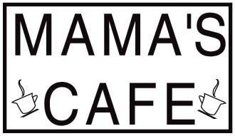
Here we've improved the margin area around the message and made it easier for the eye to read our message. By closing the space between the two lines of copy we are creating a central focus point for the eye to go to, much like a bulls-eye target. But we still have some awkward negative spaces surrounding our letters. Because of poor kerning, the black areas are spread out too evenly amongst the white areas. Try squinting at this message and you will see an overall "gray" appearance. 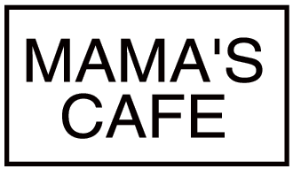
Further contrast is achieved by varying the fonts. Thoughtful attention is paid to the importance of the message. What is the main message? In this case it is "CAFE". Logically we want people to understand that this is a cafe first and that it's Mama's second. The fact that it's a cafe is probably more important to a hungry viewer than who actually owns it. (That is until Mama serves over 10 billion. ie: "McDonald's") This design has all the elements of good design. It is easy to read and has enough eye appeal to make someone want to read it in the first place. This design has personality and you can almost get a sense of the atmosphere inside "Mama's Cafe". Compare the feeling you get from this design to the first one at the top. 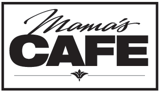
|
  |
|||
 |
|
||||
|
|||||
|
CONTACT
|
|
|
|
|
|
|