

-
36 Sales
62 Ands
62 Thes
62 More Ands
62 More Thes
Advertisers Square
Alarm Block
Albury
Aledo
Aloha Script
Alpine Script
Amarillo 2
Ambrosia
American Sans
Americana Ornaments
Americana Panels
Americana Ribbons
Americano Script
Amethyst
Angel
Anna Banana 2
Antique Half Block 2
Antique Shop
Aristocrat
Ascribe
Asylum
Ataboy 165
Athletic Club
Avalanche
Bakersfield
Ballpark Script
Bandit
Bandolier
Bank Note
Basher
Beatnik Cowboy
Becker Classic
Becker No 45
Bella Vista
Bell Boy
Bergling Panels
Betterbilt
Big Bob
Big Dog
Big Top
Billhead
Birgitta
Black Rose Script
Blacksmith
Blackstone
Bluegrass
Blue Ridge
Boot Camp
Bootcut
Booth
Borges Catchwords 1
Borges Catchwords 2
Boston Ballpark
Bostonian
Boston Truckstyle
Bounce Script
Branding Iron
Brianna
Broadway Elements
Broadway Panels 1
Broadway Panels 2
Broadway Panels 3
Broadway Panels 4
Brooklyn
Brough Superior
Brushwork
Bulldog
Burbank
Burly
Cafe Corina
Californian
Calileo
Cameo
Carbondale
Carnivàle
Cartoon Cowboy
Casablanca
Castlerock
Cavalero
Cedar Creek
Centennial Banker
Centennial Panels 1
Centennial Panels 2
Centennial Panels 3
Centennial Panels 4
Champ
Chapman
Chateau
Chesham Sans
Chicago Script
Chromeliner
Chunky Block
Cigar Band
Cincinnati Poster
City Boy
Claretian
Classic Caps 2
Classic Panels 1
Classic Panels 2
Classic Roman 2
Coffee Shop
Colonial Roman
Columbiana
Comic Caps 2
Commie Caps
Conclave
Confection
Confection Essentials
Conservatory
Convecta
Cool Blue 2
Cordial
Cornbread Casual
Corner Specimens 1
Corner Specimens 2
Corner Specimens 3
Corrie
Cosmic Cursive
Counselor
Country Road
Dark Horse
David Design
Desire
Desire Rough & Ragged
Dickinson
Diploma
Distressed Block
Divine
Dixon Script
Doc Terwilligers
Dreadnought
Dublin
Duetta
Durango
Egyptian
Elixir 2
Emporium
Enchanted
Encore
English Rose
Engravers Ornaments
Ephemera
Equinox
Esoteric 3
Essendine 2
Euphoria 2
Factory
Fairground
Fancy Full Round
Farango
Fast Slant
Fat Cat
Fat Daddy
Fine Cut
Fine Line Roman
Firehouse
Five & Dime
Flamingo Script
Flash Script
Flathead
Folklore
Full Block
Future Tense
Garner
General Store
Gilmore
Ginger Ale
Gloria
Golden Era Art Elements
Goldsmith Script
Grants Antique
Grindle
Gunslinger
Gypsy
Hambone
Hamilton Nailhead
Hamilton Ornate
Handyman
Happy Fun Ball
Hastings Gold
Havana
Hazel
Heller's Script
Henderson
Hensler 2
Heritage
Hertford
Hexagon Modern
Hick Sticks
Hindlewood
Hudson
Imperial
Indian Script 2
Inkling
Ironhorse
Iron Knight
Iron Lace
Jalopy Joe
Jeff Marshall Script
Jewelo
Jumbo
King Edward
Kips Bay
Kiwi Casual
Kodiak
Kona Bold
Kung Faux
Lakeside
Larcher Roman
Light Face Roman
Lincoln
Locksmith
Logomotive
Lonerider
Lumbermill
Mackinlay
Magnum44
Main Street Ornaments
Main Street Panels
Majestic
Marie Script
Mastercraft
Matthews Modern
Matthews Thin
Melissa
Menace
Mercantile
Metro 39
Mikes Block
Milkman
Mister Kooky 2
Mister Muster
Mocha Script
Monogram Circle
Monogram Diamond
Monogram Oval
Mystery Font
Naylorville
New English
New Modern Classic
No Fishin
Novela
Nouveau Block
Nugget
Old Abe
Old Block
Old Flame
Old Iron
Old Stock
Old Tom
Olde Hickory
Opening Night
Orange Grove
Orchard
Ortlieb
Packard Script
Palace Bold
Pandora
Phantom
Pickle Barrel
Pierre
Pipeline
Piranha Script
Prentice
Preston
Prince
Pullman Train
Quadrex
Quaker
Quantum
Razer
Ragged Brad
Ransom
Raven
Rawson & Evans
Red Sable Script
Resolute
Retro Cafe
Retro Ricky
Ridgecrest
Ringer
Riverboat
Robusto
Roebuck
Ron Aplin ScriptNEW!
Roper
Ross 1929 Roman
Ross Antique Roman
Royal Crimson
Royal Script
Saddleback
Sadey Ann
Safire
Sanborn Thin
Sarah Script
Saratoga Ornaments
Saratoga Panels 1
Saratoga Panels 2
Saratoga Panels 3
Saratoga Panels 4
Sawbones
Scarlet Script
Scriptana
Sedona
Seranoa
Shelsey
Sheridan Script
Shocard Rodeo
Shogun
Shopfront
Signature
Signkit Script
Signmaker 2
Signwriter Roman
Silent Movie
Sinclair
Smalts
Sofia Script
Spaz
Speakeasy
Speedstyle
Spencer
Spindly
Spirit Script
Splash
Springfield
Spurred Egyptian
Square Block
Squeezebox
Stanford Script
State Fair
State Street
Stetson
Stevens Percepta
Stonecutter
Stonegate
Story Book
Stove Pipe Thin
Stratford
Stunt Roman
Sugargirl
Supply Co.
Swindler
Tallington
Tarantula
The Bat
Thick & Thin
Tideway Script
Timberlodge 2
Tonic
Towne Hall
Tributary
Triumph
Trolley
Tubby
Tuco's Revenge
Understudy
Union Thug
United Trade
Unlovable
Valencia
Vaudeville
Verdi
Versatile
Victoria
Vienna
Wade Dynamic
Wade Grotesque
Waterloo
Welo Thin
Western Rose
Whistler
Winchester 73
Woodmere
Workhorse
Yuma
Zenith 
-

-

-


-


 |
ACCOUNT LOGIN |  |
YOUR CART |  |
|
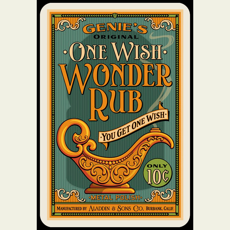 2016 Design Competition Winner: 1st Place Artist: Mack Fraga Client: Genus and Circa We were really excited when we first laid eyes on Mack's card designs. Besides the sheer number of LHF fonts used, we don't get to see many designs using LHF Spencer and this was exactly the kind of application the font was intended for. We liked the choice of the fonts and the way the curves of the letters complimented the theme. The colors are very unusual and yet true to the period. The layout is great and draws your eye down and through the design in a very natural way. Well thought-out panels help to organize the subcopy. For his excellent work, Mack wins $100 and his choice of any LHF font. Thanks Mack! Letterhead Fonts used: LHF Spencer™, LHF Kona Bold™, LHF Fairground™, LHF Antique Half Block™, and LHF Ross Antique Roman™ Chuck: The color scheme for "One Wish Wonder Rub" design is quite unusual. Did you choose these colors based on an existing advertisement that you saw? Mack: I had a snippet of paper ephemera. Knowing I was going to use a gold-toned magic lamp helped start the choice. But, feel how warm those yellows are against the off-prime back colors! Chuck: We really like the way the inner scrollwork creates separate orange panels. Very clever. Was the original intent to have a solid teal background and then you felt that it needed to be broken up? Can you tell us how that choice was made? Mack: Again, the snippet of ephemera suggested it. Plus, I wanted a nice bit of Rococo architectural detail to frame and anchor the composition (a first layer introduction towards the Persian/Moorish arch shade in the background) and, to compliment the scrollwork on the lamp. The background pinstripes add an almost fabric-like texture. Chuck: We don’t see a lot of designs using LHF Fairground, but it has always been one of my favorites for sub copy. Why did you use it here? Mack: Readability and character. Also because it is a condensed typeface. Condensed typefaces aren’t used enough. They serve a great benefit. More characters (information) at the same point size. And, they were cut/drawn by a skilled craftsman/designer to be condensed. Using software to scrunch (torture, really) type into a condensed fit is like nails on a chalkboard. My friend Dan Solo used to call that "Dreadful Typography". In addition to having great character, LHF Fairground is also a ’polite’ sub copy face. It doesn’t demand attention that might distract from the hero lettering in the piece. It’s just there doing its job. But, subliminally, its not boring. Chuck: Why did you choose LHF Ross Antique Roman for the sub-copy? Mack: For the Aladdin & Sons company signature? Again, readability and character. And, I could imagine it on the company signage, doors, stationery, circa late 1920’s… you know, when they hand painted the name of the occupant on the glass of private office doors. Chuck: Can you tell us more about the publisher of these cards and the constraints they gave you to work in? Did they give you any direction? Mack: LOL. Well, as it happens, I am the publisher. I'm a toy and game designer by trade. One Wish Wonder Rub and Instant Karma are just two designs from a card game I invented. We'll be doing a Kickstarter later this year which I'm really looking forward to. I drew over 114 cards/designs for the game. The constraints were to be faithfully accurate to whatever period the design was emulating. The designs collectively span a broad number of periods from fin de siécle to oh, about maybe the late 60’s. The whole project was immensely rewarding. It let me scratch nearly every style itch I had harbored over the years in one fell swoop. Chuck: The "Instant Karma" design is an excellent example of a well-thought-out layout using panels to divide copy. What is your previous professional experience? Were you a sign designer? Mack: That’s a very high compliment, Chuck. Thank you! I was actually a Banker and then a Crab Fisherman before I jumped into the design world. My biggest influence was working for my friend and mentor the well-known type historian Dan X. Solo. I began as a touch up artist and then proceeded to apprentice with Dan into a full-on typographer and lettering artist. Dan Solo was a master at replicating accurate period typography and layout. Those were my first lessons with him. An early example was a side by side comparison of a western style Jesse James Wanted poster someone was asking him to design (to their layout). He pointed out every historical inaccuracy in the layout and why it never would have been produced that way…and why it mattered. Though he had an extensive collection of wood and metal type from which he could print on his own presses, Dan was also a proponent of sign designers (painters/letterers/showcard artists) where the hand of the artist shows in the results. Balanced to-the-eye and perfectly imperfect. Today, lettering might often be a bit too perfect…that is if one is going for an authentic period look. Computers are exceedingly accurate. Sometimes too much so. Mathematical perfection is not warm and inviting. Rule of thumb: Don’t let the computer do all the work for you. Bake in a little imperfection. I very often do a great deal of hand work to letters from a typeface that I'm using for a headline or title. You have to…to improve balance and spacing, eliminate tangents, correct unintended distortions…and just plain keep it from looking like a computer produced the results. I do as much hand-lettering as straight-up typesetting. It's worth repeating: Don’t let the computer do all the work for you. (I'd like to see that made into a framed cross-stitch sampler and hung in every design studio.) By the way, the shadow on the Instant Karma lettering is known as a "lazy shadow". As far as I know this is not an effect found in any design software. Chuck: How old are you now? Mack: I am vintage 1959. Hey… same year Alaska and Hawaii were admitted to the union! Chuck: What software do you use in your work? Mack: Photoshop, Photoshop, and Photoshop. And sometimes I'll switch up and use Photoshop. On a Mac, of course. Chuck: You have a real talent for choosing color. What advice would you give to others who might feel overwhelmed when it comes to making color choices? Mack: You can begin by endeavoring to be historically accurate… true to the samples from a given period. That helps home in on choices… right? So… research. Obviously scan the web for samples of vintage ephemera and signage. Start a photo album of signage you encounter in your travels. Build a library of those amazing period style books: Matchbook art, comics advertising, period packaging, travel posters. (by the way, a big thank you to the authors and publishers who produce these volumes. You know who you are. Bravo and keep them coming… I will buy every. single. one.) In addition to collecting samples, it really is about having a "long memory" of your own observations and experiences, and applying what you come to learn is true and appropriate. Bottom line? Soak it all in. Chuck: You have a real talent for choosing the appropriate fonts. What advice can you give to other who over feeling overwhelmed with font choices these days? Mack: Wow… that’s a three beer conversation at least! Let's start with, are you curating your collection of typefaces? I have mine sorted in a folder I call Fonts By Design in which I have folders for dozens of themes and styles… Art Deco, Romans and Italics, Blackletter & Uncials, Showcard, Streamline & Moderne, Techno-Industrial, Egyptians, Fat Face, and so on. The mere act of foldering (verb?) all my typefaces over the years has helped me mentally catalog them for future choice. And then sometimes I’ll just see a typeface whose character just jumps out at me and I'll look for an excuse to use it. Right now I’m looking at LHF Emporium and I want to create a project just so I can use it. Just look at the character in that typeface! It was like that for me with LHF Spencer and LHF Signmaker… I was just itching to use them. One Wish Wonder Rub and Instant Karma were perfect vehicles for them. Now, I’m not saying put the cart before the horse. We don’t have that luxury in commercial assignments and it would be wrong to shoehorn the clients needs into our preferences. But, sometimes it just works out so nicely. Now I get to choose two new typefaces. LHF Emporium is definitely one. |
  |
 |
|
|
CONTACT
|
|
|
|
|
|
|