
 |
ACCOUNT LOGIN |  |
YOUR CART |  |
|
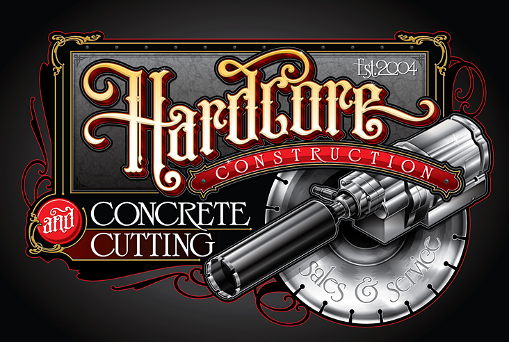
2015 Design Competition Winner: 3rd Place Artist: Jason Nale Client: Hardcore Construction The judges were impressed with Jason Nale's "Hardcore Construction" design and its creative use of type and minimal color. The illustration is very well done and meets the requirements of the client, while integrating well into the rest of the design. Jason wins his choice of any LHF font. Fonts used: LHF Old Iron™ LHF Light Face Roman™ and LHF Stunt Roman™ Chuck: There are really only 3 basic colors in this design: red, black, white and yellow. Can you explain how you manipulated the various shades to create dimension and separate the copy? Jason: Just by using high contrast where needed and by using a series of outlines incorporating varying colors and shades. I tend to use this technique for all my designs. I'm a big fan of interlocking outlines to make things pop. I actually think that this is a characteristic of my work that makes it unique. Chuck: The illustration is amazing. For those not in the business, can you tell us what it is exactly? I see a concrete saw blade, but what is that in front of it? Jason:It is a special piece of equipment used to drill through concrete. I had never seen one before but apparently in that industry it is a common tool. I had to use picture references to create the illustration. Chuck: Was it difficult to pull off this illustration? How long did it take? Jason: It had its hard spots but for the most part it was relatively simple. All together it might have taken maybe 8 or so hours. I really enjoy doing technical illustrations so it didn't seem like it took that long. Chuck: Why did you choose LHF Old Iron™ for the main copy and LHF Light Face Roman™ for the sub-copy? Jason: I wish I had more of an exact answer for this question but truthfully, I usually go through my fonts and pick a few that I think will work out and from those choices I narrow them down until I really like one and think that it could work. It's more of an instinctive feeling I guess. There are times when the font I choose for a design doesn't work out as well as I had thought at first. Sometimes after I've incorporated the background images into the design, the font I chose to begin with no longer fits the design. In this case I thought Old Iron lent itself to a "hardcore", fancy but not too fancy, classic style that worked out perfectly for this design. I guess part of the reason I used it was that I had just gotten it and really wanted to use it. It's a great font with so many alternative letters that the combinations are practically endless. 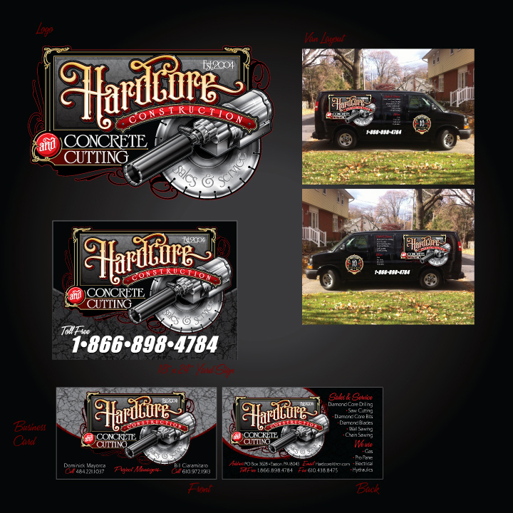 Chuck: The scrollwork looks familiar too. Is that from Mike Jackson? Did you add any yourself or modify any? Jason: I love Mike Jackson's scrollwork. I love using them as a basic form and than modifying them to work in my designs. I'm always cutting them apart and using pieces, combining them and changing them to fit my needs. Chuck: How much input did the client have in this design? Jason: In this case the client let me pretty much run with whatever I thought would look good. He did want the piece of equipment in the design somewhere. Chuck: What programs were used to create this design? Jason: This and all my designs are created in Adobe Illustrator CS3 with a mouse and only on one layer. I feel comfortable doing them that way. If you open any of the designs I have done, there is a “layer 1” and a “parts” layer. All the work is done in the layer 1. The parts layer contains everything that is not used, original elements that were modified, fonts that were used and not used, copies of the final design, progress designs, etc. I like to have access to everything I used to make the design, just in case I need to make a change or maybe even use some of those unused items for other designs. Another odd thing about my design process is that there is not one stroke in any of my work. I use offset paths for all the outlines, and I really like to use outlines. Chuck: How long have you been designing? Jason: I've been an artist my entire life but have been designing in the sign and graphics industry for about 12 years. See more of Jason Nale's work at: Nazareth Sign Company |
  |
 |
 |

|
CONTACT
|
|
|
|
|
|
|
