
 |
ACCOUNT LOGIN |  |
YOUR CART |  |
|
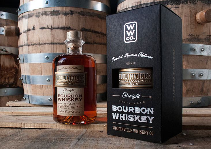
2014 Design Competition Runner Up Artist: David Cole Client: WoodinVille Whiskey Company The judges chose David Coles' "Woodinville Bourbon Whiskey" design as the Runner Up for its classic sophisticated appeal. While the label contains a lot of information, care was taken to prioritize the copy in a way that leads the eye through the design. From its deeply stamped metal foil stamp to the understated black box, the customer knows that this is more than just a whiskey. It's a work of art. Fonts used: LHF Woodmere™ & LHF Packard Script™ Chuck: Did the people at Woodinville give you any direction or did you have free range to do what you wanted? David: They wanted to elevate the brand name in comparison to how it's represented on their existing products, where "Woodinville" isn't prominent enough. So, make the logo bigger, as they say. And the package design needed to help justify the $100/bottle price tag. Beyond that, it was wide open to my interpretation. I'm lucky to have a lot of latitude with these guys. But within that sort of free range situation, I constrained myself to work within their existing brand ethos, and - because this product marked an important release of their first truly aged (over 3 years) whiskey and would be priced accordingly - I tried to "mature" the look just enough to reflect those higher standards - without losing touch with their popular "everyday" products. Chuck: Why did you choose LHF Woodmere™ and LHF Packard Script™? David: Whiskey makers in general and this client in particular have a drive to connect with a long tradition of American craftsmanship and pride. But nobody wants to look like they are trying too hard. For those reasons these (and many LHF offerings) fit the bill perfectly. They are classic, well crafted and with just a bit of flair - but not too much. The attention to detail in the design of LHF fonts reflects the same attention to detail I strive for in my work. And the stylings are always very appealing to me. These two in particular reflect a classic aesthetic which is perfect for premium, hand-made American products. Chuck: Not being in Seattle, we aren't able to fully appreciate the label paper and the embossing. Can you describe it for us? (The embossing job is amazing.) David: The label is a two-part setup. The paper portion is printed on Neenah's 60# Cream Estate No. 9 Laid so it's heavy, toothy and has that nice, laid texture to it. Laying across that is a hand-applied, stamped aluminum nameplate with a hand-rubbed patina making the letters really pop out - so each one is actually slightly unique. Both portions were expertly printed by my friends at Elite Label in Seattle. Chuck: Did you have a say in the bottle and cork as well? David: For this project I did not. For cost reasons, I was constrained to using their existing bottle and cork which are the same structural elements used on other of their existing whiskey products. No loss in my opinion, because they are both fantastic. For their next release I was lucky enough to be able to evolve this entire package and design a new, custom glass bottle. I'm excited to reveal that as soon as production begins, in the coming months. You'll see some familiar typefaces on that one as well. See more of David Cole's work at: davidcolecreative.com |
  |
 |
 |

|
CONTACT
|
|
|
|
|
|
|
